MARS PETCARE
Defining the Sweetspot
Mars Petcare is a business with multifaceted needs.
The FMCG petfood market is fast moving, and consumers expectations are developing at a rapid pace. It was clear that Mars were losing out on revenue and market share because of their lack of the intelligent, personalised experiences that consumers now expect as standard. The owner of several major pet food brands, Mars knew that it needed to evolve into providing services in addition to manufacturing physical products - services that would create meaningful connections with existing and new customers, opening up new revenue streams and access to a wealth of mission-critical data and insights.
Pet wellness is a universal, pervasive pain point for pet parents. They are often reliant on trial and error even when working with vets to resolve problems and (in spite of their great love for their pets) there is a surprising and serious lack of education around vital, preventative activities. How could Mars alleviate this pain, greatly enhance the wellbeing of pets and, in doing so, create those meaningful, lasting connections with its customers? How would we help Mars build empathy?
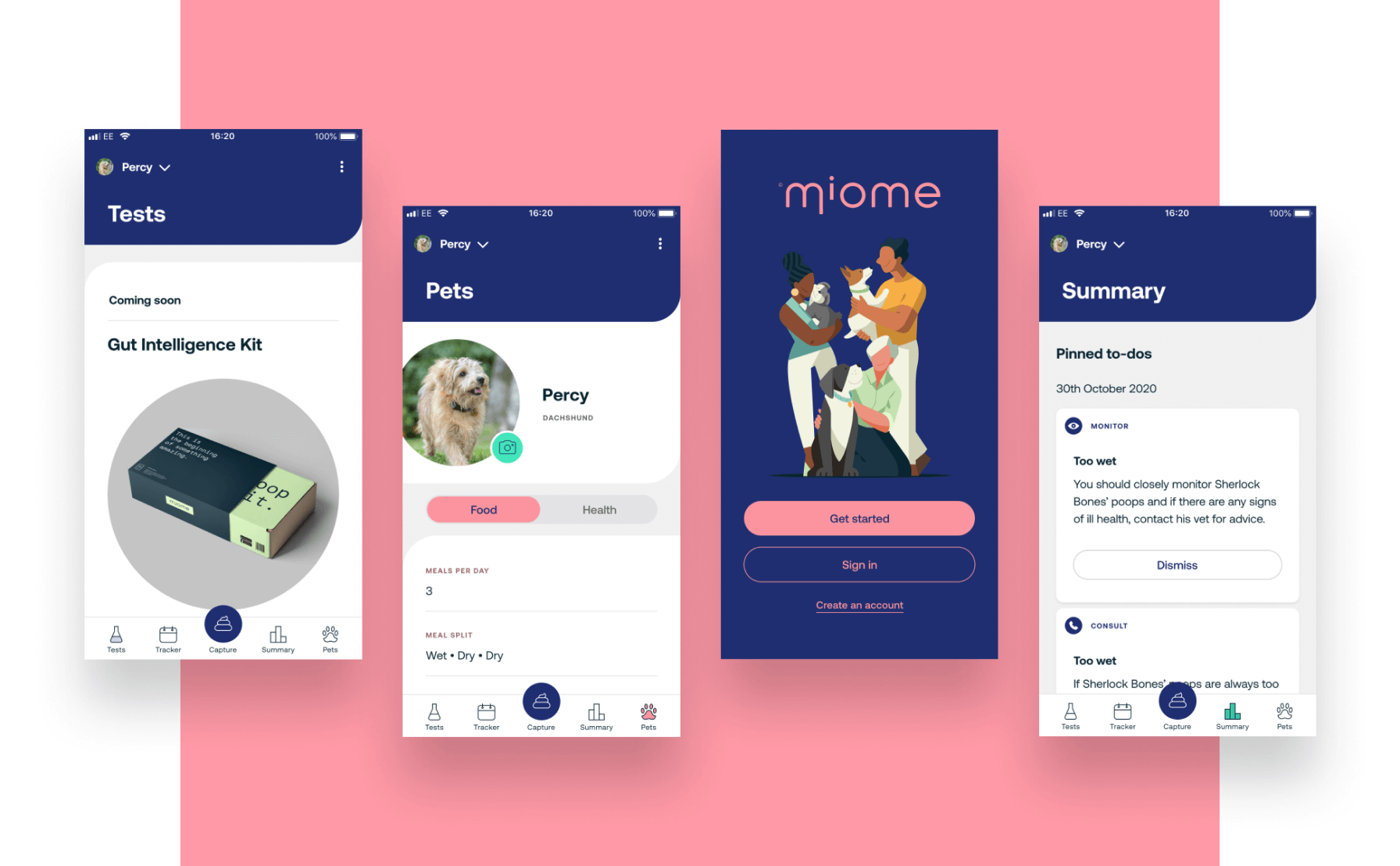
The size of the opportunity in this still-emerging sector amounted to hundreds of millions of dollars across gut, skin, oral, mobility and more, and Mars had already begun developing a home test kit and drafting early concepts for a Miome brand.
But how would a full end-to-end health testing service work? How would it generate revenue and collect data? How might it become a companion to having a pet, a service so integrated into home life that it gets relied upon and enjoyed every day?
Meanwhile, in Mars’ product development labs, it had also created an API and image processing tool, and wondered whether this system might form part of the quest for a valuable consumer-facing proposition.
With Mars’ vision, big questions, API lab tool and test kit concept laid out before us, the Candyspace team focused on designing and building a rapid proof of concept (MVP), which would define the sweetspot where their customers’ demands aligned with their business needs, and where real value could be delivered to both sides of the equation.
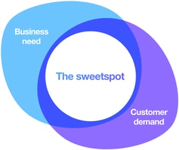
BUSINESS NEED
• Establish Mars as a trusted expert in pet care
• Devise a new service-driven proposition
• Generate new revenue streams
• Gather data and actionable insights
• Create deep, long-term connections with customers
CUSTOMER DEMAND
• Enhance the wellbeing of my pet
• Empower me with knowledge, reducing my anxiety and guesswork
• Help me prevent problems
- The few existing test kits and their associated digital services were very under-developed in terms of user experience: information was not well-organised, and the design made information harder to understand, placing a significant burden of cognitive effort on the end user.
- Building an active user base will require more than test kit features alone.
- We needed to cater for pet parents in proactive, preventative and problem-solving states, and to understand these states in much greater detail.
- Although attitudes are moving towards more proactive care, pet parents still find it easiest to spend on needs that they can see and understand. Giving them better tools to monitor and interpret their pet's needs would help them provide better care.
- Observation is a pet parent's only real tool to be proactive in caring for their pet. Interpreting what's actually going on is very difficult because pets can't communicate.
- Looking at gut health, nutrient absorption through better digestion is seen as a way to improve multiple body systems across markets and cultures, and healthy digestion is considered by many to be the basis of a dog's overall well-being.
- Digestive issues are a common and very noticeable issue that affects both dogs and pet parents.

User interviews
We were grounded in Mars’ business objectives, and had now learnt a great deal about the market, competitor businesses and a bird’s eye view of pet parent needs from our absorption of the research.
But we needed to solve real-world problems for pet parents - something useful that combined utility and usability. We needed to understand how to build trust and an emotional connection with them so they would be comfortable buying test kits, and so that we would become part of people’s daily routines.
People don’t get pets because they want something to feed and walk etc., they want something to care for, to love and have a friendship with. Pets are part of the family.
For the first round of interviews, we asked people to tell us the stories of their daily lives with their dog, what a great day as a pet parent looks like, what a bad day is like, and much more. We used this to pick up signals on worries and problems, and explored these with them too. People’s detailed knowledge of their pets’ wordless communication really shone through, as did their deep love and affection for their four-legged family members.
Uncovering mental modes
We are curious and open-minded so we lean away from traditional personas. Whilst they can be a useful shorthand for aligning groups around human needs and making sure these are central to a solution, they can also cause us to make unhelpful assumptions about people and compromise that curiousity and open-mindedness.
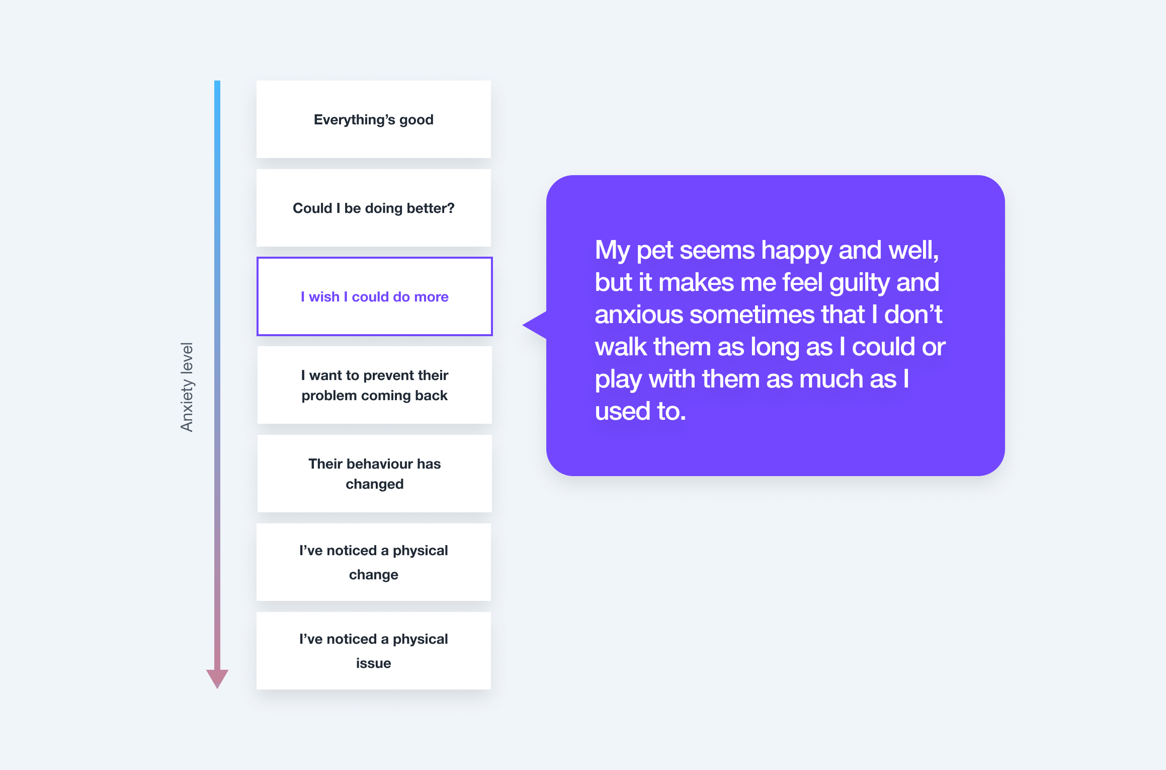
This was once again borne out in our interviews. We saw that pet parents shifted between different modes of thought, feeling and behaviour based on what was going on with their dogs - and this had nothing to do with demographic information. The same parent can switch between several mental modes in the same day, depending on what is happening with their pet. These mental modes underpinned our thinking and approach, and would later inform feature decisions and even the language of Miome.
Highlights from our findings
We conduct different kinds of testing and research throughout a product’s creation and lifecycle depending on what we need to know, but our favourite kind is always 1 on 1 sessions with real people. Regardless of whether we are conducting user research or usability testing, these 1 on 1s always yield information that results in some of our most relevant, novel and potent insights.
Here are just a select few of our favourite insights from our months of prototyping, testing, learning and designing.
Not all pet parents seem to understand the connection between dietary decisions and outcomes
Some basic education around (for example) the risks of feeding your dog human foods seemed to be missing for a few participants, along with the basics of things like providing structured meals and a structured day for a minority of them.
A household or shared view of each registered dog was the unexpected hero of testing
An idea born from talking with participants. Though it might seem obvious now, at this stage in concepting we had only considered one person tracking their family’s dog on one device. Participants saw “shared ownership” as a time and worry-saving way of co-ordinating and sharing the load, making sure things had been done without having to ask or chase, and involving the wider family in care of the dog. Those with kids were delighted by the prospect of being able to use light gamification to keep their kids involved and taking responsibility for dog care.
Reduction in insurance costs through using Miome
Participants were very interested in the idea that being a Miome user or using Miome test kits could lower their pet insurance payments / offset the cost of insurance in the style of Vitality. If the reduction in insurance payments was greater than the combined cost of kits for the period, this would be very appealing.
Continuous discovery is business-critical
In order to craft a successful product that meets business and consumer needs, discovery can’t be something that ends neatly at the end of a phase. Continuous listening, learning, ideation and testing (again) is vital in order to reduce risk and drive value.
Practising continuous discovery means product strategy, UX, design and even technical decisions can be made based on evidence, and actually progress with greater confidence and speed. Far from being a fluffy “nice to have”, evidence-based decision-making mitigates the risk of you launching a product that underperforms - or worse still: one that nobody wants. It’s expensive to launch untested assumptions.
Technical proof of concept
At the same time as participating in research outcomes and ideation, the development team began work on a technical proof of concept for the image processing API from day one. Their parallel challenge was to build a fully operational technical proof of concept app in 6 weeks.
While the UX and design team worked to figure out what a thin slice product MVP might look like and began to engineer user journeys, the developer team sought to understand how Mars’ API and image processing back end could be made production-ready i.e. making a lab-produced API clean, efficient and stable enough for public use. They identified risks in order to mitigate against them, and ran spikes to answer questions and eliminate assumptions.
Choosing a technology
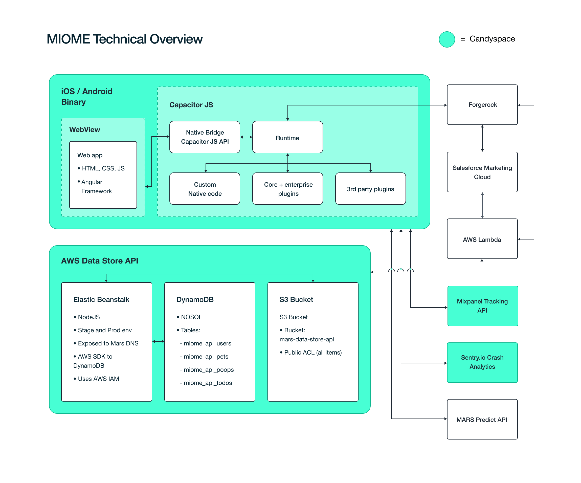
The UX team was confident from early in its work that to achieve Mars' vision and best serve pet parents, the product ought to be an app. Part of the task at hand for the developers was to recommend the right tech stack for the job. They selected Ionic: a framework that would allow them firstly, to get a quality product to market faster, and secondly, to produce both a native iOS and Android application with a largely shared codebase for ease and economy of maintenance and pace of ongoing development.
Ionic also benefited from a range of pre-built, pre-tested enterprise-ready plugins, which allowed the developers to ‘drop in’ some of the required functionalities with the guarantee of compatibility. Ionic’s infrastructure also provided the developers with an enterprise grade Continuous Deployment system, AppFlow. This greatly increases development speed due to all application builds occurring in the cloud, freeing up the developer to focus on the code.
Rapid Ideation & Testing
Divergent thinking - casting the net wide
Co-creation is very important to us as a design and build company. We do better work and create better outcomes when our clients are partners in our process and not just invested in the work. We passionately believe that design and development need to work together to achieve the best results at pace. Design thinking is not just for designers. Technology is not just for developers.
Understanding why and how we are building something and what the benefits will be makes for better quality problem-solving.
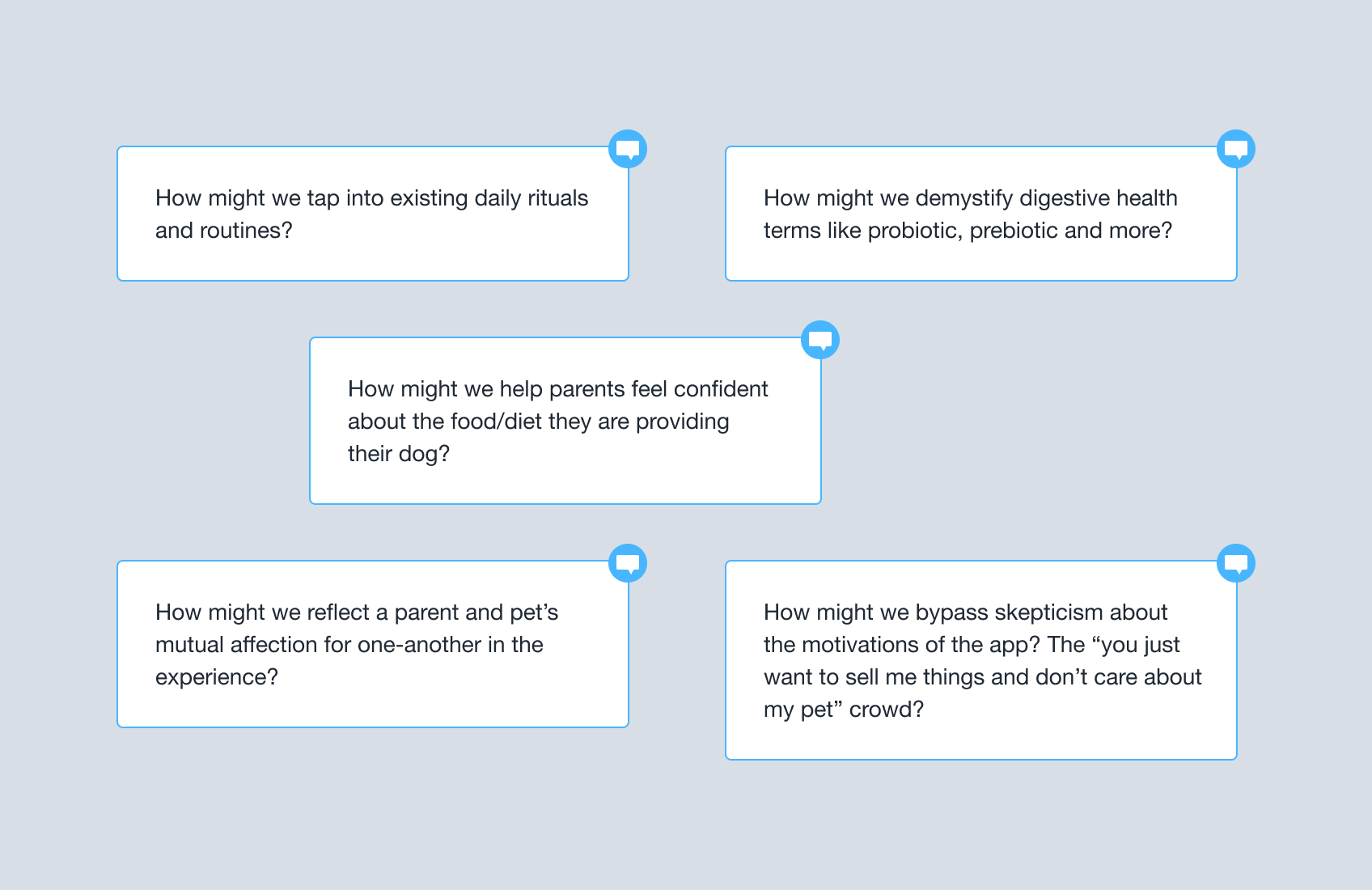
How Might We
“How Might We” is a way of framing our thoughts as non-solutionised questions so we can go broad and think about our challenges from many different angles before zeroing in on the most important things. Limiting oneself too early risks missing out on potentially brilliant and unique avenues of thought and ideas.
“How” assumes an opportunity exists, “might'' says we don’t have to do something “we” is about co-creation. When it comes to a problem, how might we amp up the good? Remove the bad? Explore the opposite? Question an assumption? Change the status quo?
Convergent thinking: looking for themes and voting on our favourites
With our statements laid out, we grouped them into categories and kept shuffling until themes emerged (a process known as affinity mapping). Once we were satisfied, we labelled the themes e.g. habitual use, trustworthiness, education, motivation, insights and more. Then, with 3 votes per person, we voted on which statements we each felt were the most important things to get started with. A small number of votes each forces one to focus on what really matters.
The items with the highest votes would be the first we produce ideas for.
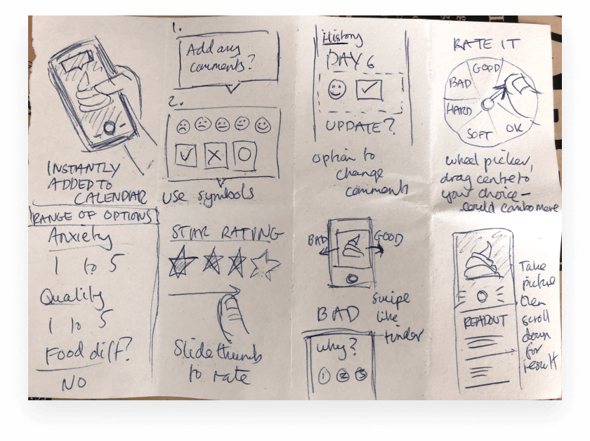
Rapid sketching: “crazy eights”
Producing a low-fi, visual sketch of a totally different idea every 60 seconds means we can generate a huge breadth of ideas in merely 8 minutes. If we decide to dismiss an idea, the cost to the project is nil. After working together (UX designers, devs and client partner) to produce all of these ideas, we voted on our favourites. These would be the ones we’d develop further and then evaluate them with pet parents.
Testing ideas
We produced wireframe prototypes to help us illustrate our strongest ideas to pet parents. Keeping things in wireframe form can help prevent testers from getting distracted by aesthetics and content when we’re looking to validate the ideas themselves.
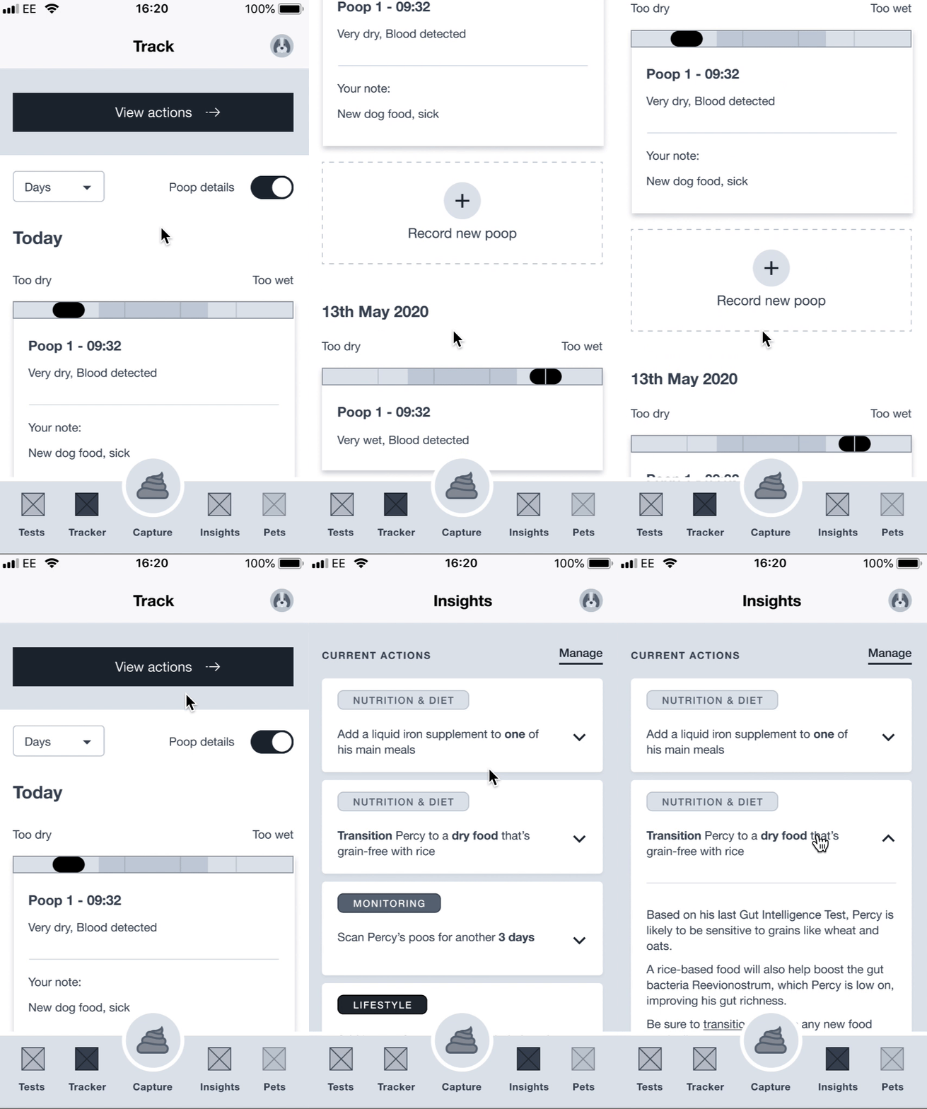
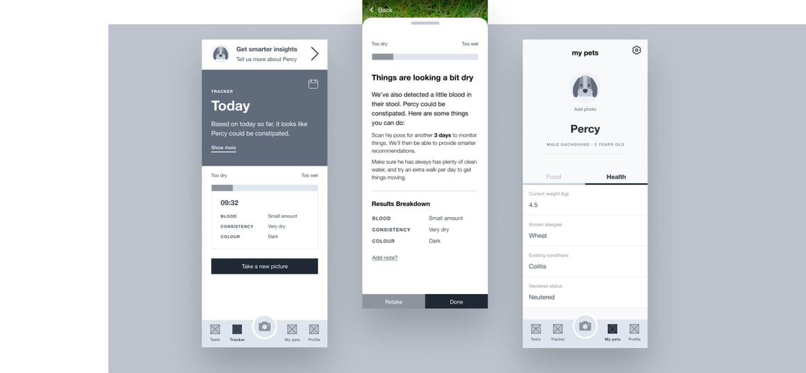
We allowed people to use the prototypes themselves, and looked out for them relating our solutions to their own problems - what did they seem to be finding useful? What were they excited about? What were they skeptical about? Did they understand the concepts without any prompting from us?
This often gave us further ideas, and always paths to further strengthen the work.
With a clearer picture of what would be most valuable to pet parents alongside supporting Mars’ objectives, we were able to craft our product and emotional proposition and move into design with confidence.
Designing the app
Daily Alignment
When creating a product, it’s vital for tech and creative to stay closely aligned from start to finish. Daily meetings between our designers, developers and QA were invaluable as they ensured the team was up-to-date on not only the design work but the rationale behind it. The technical teams were also able to contribute to problem-solving in design, giving them a heads-up about any potential technical limitations or complexities that might be able to be avoided without cost and compromise to the user experience.
Architecture and Journeys
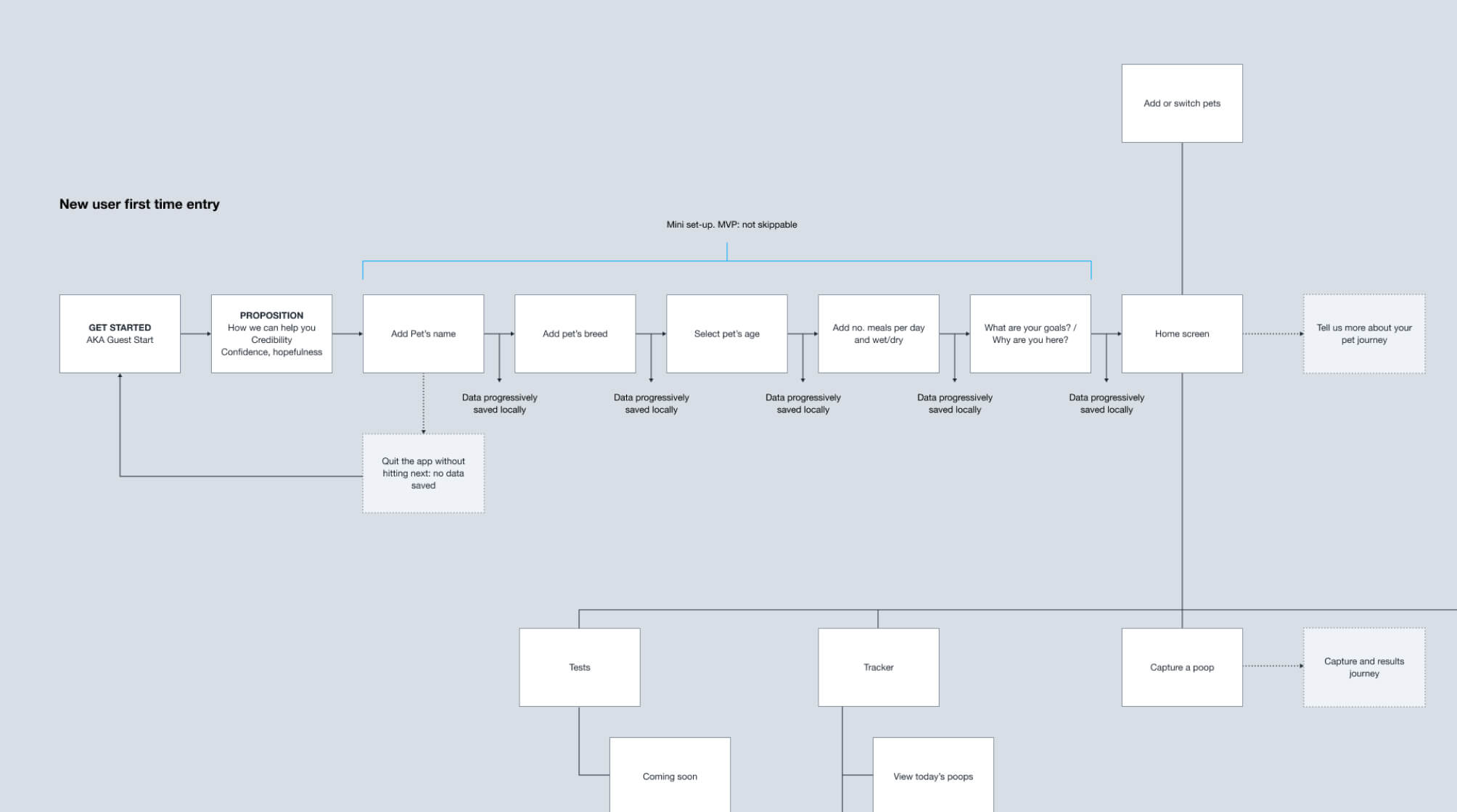
After further iteration, we organised our app content and features into an information architecture, which allowed us to think about what kind of navigation we needed - and how that navigation might scale over time.
We laid out key user journeys to help us plan out app logic, identify any gaps and hygiene we needed to account for, and then built out our wireframes using these journeys.
From brand to visual language and design system
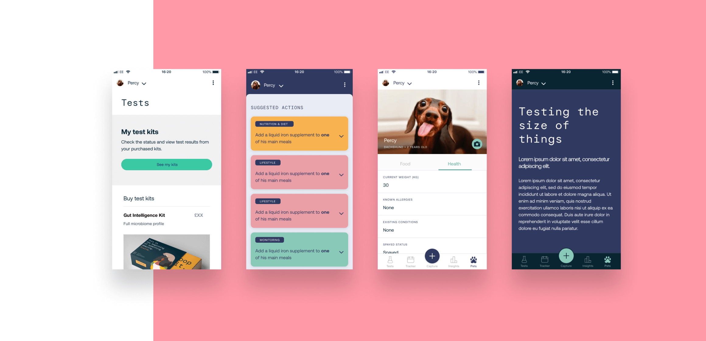
We began to test the work Mars had done with brand elements in a digital setting. We looked at colour saturation on screens as opposed to print and physical, as well as the hierarchies and semantics we might need colour to convey to the support the UX, and the contrast necessary for high-scoring accessibility. We looked at typography and iconography, again thinking about the hierarchies we’d need as well as screen legibility.
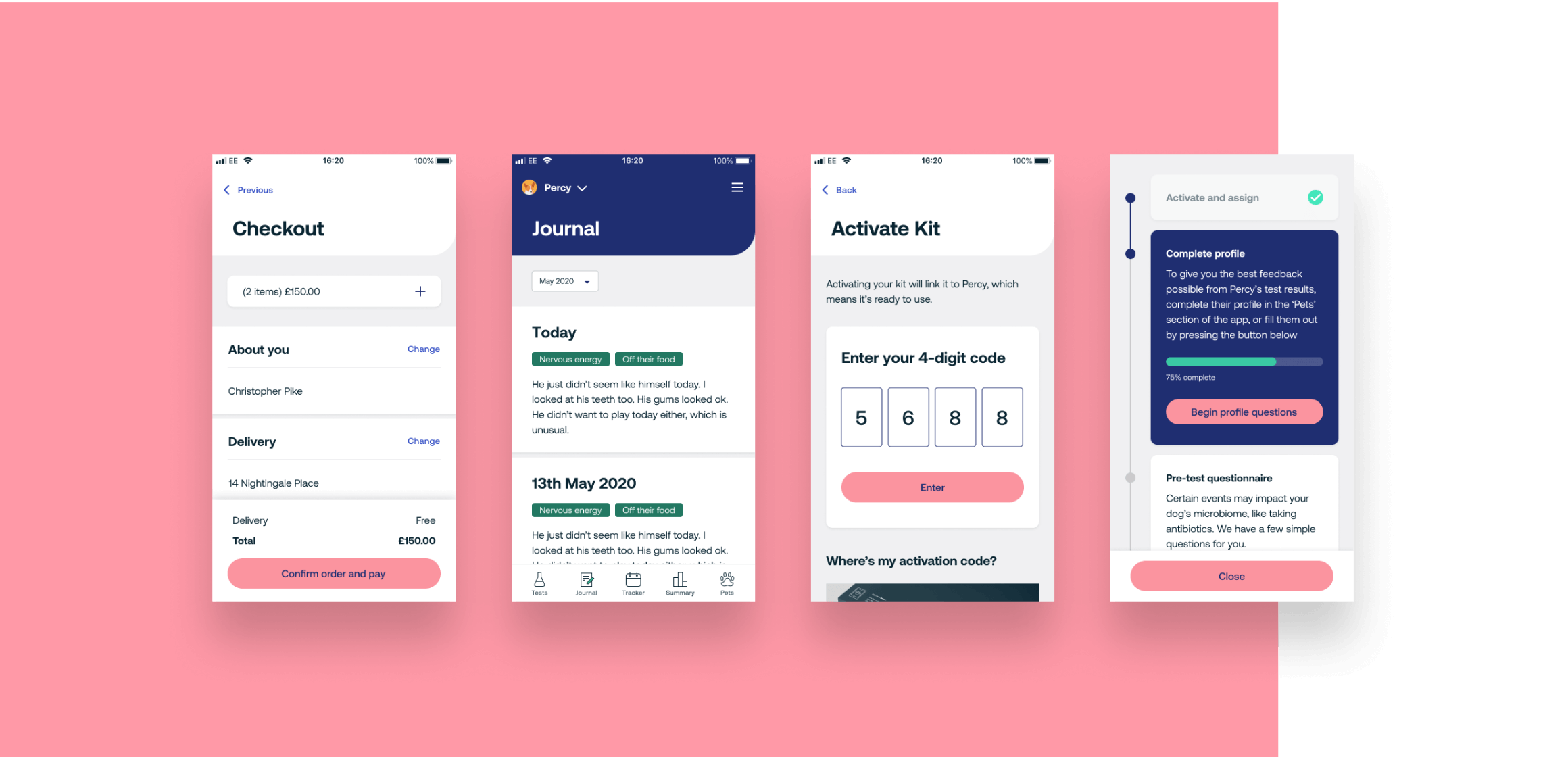
We focused on a digital execution of the brand and evolved many elements arriving at a design language for the app that we, the brand team and Mars were happy with. The visual design and language would be a key part of the app’s emotional proposition - the empathy layer we always seek to build - how we make meaningful connections with our users. We tested key variants with pet parents. We wanted to understand what it said to them and how it made them feel. We had produced something that our testers felt was trustworthy, and that conveyed scientific credibility as well as human warmth.
Motion and Feedback
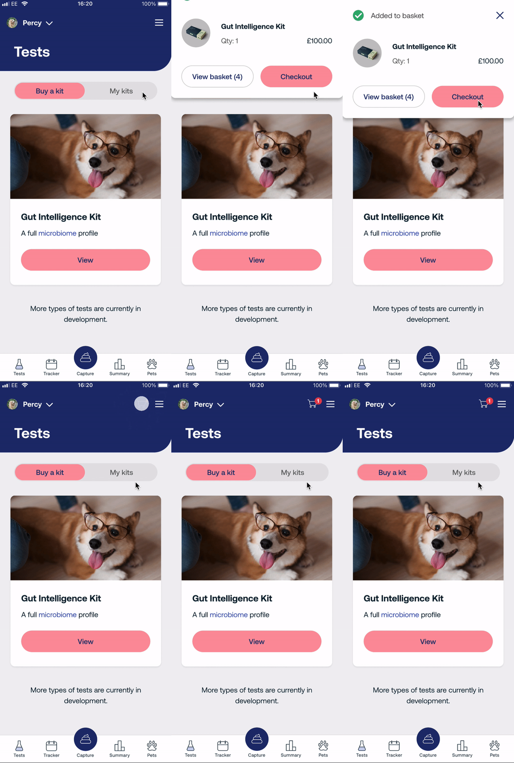
We carefully considered how to use motion to support the UX, helping people understand how they were transitioning around the app, and giving them feedback such as for successful actions. Our interaction design also contributed to the app’s personality - an important part of our using design to create a connection with people.
Build
Running in Parallel
Developers and QA were in the project from the start, collaborating with the UX team and so understood the vision, the objectives before beginning to build their first features.
With the screens, states and data-flows laid out and fully annotated, the technical team began building the app. Working in parallel with UX, the developers could work on current features whilst being aware and contributing to the planning and development of future features in the roadmap.
With a team of developers each assigned a feature to build, the application quickly grew to life; and with the benefit of a shared codebase for both Android and iOS, the application could be deployed simultaneously to both platforms.
Agile to the core
Following the rapid development lifecycle of Miome, the Product Owner quickly began tweaking the focus to ensure stakeholders and business priorities were maintained. The well-versed development team had no issues shifting from one feature to another; maintaining top-quality code and outcomes. The team easily partnered up and filled in gaps where features or 3rd party services required that extra level of effort to ensure the stakeholders, and eventually end-users had a great experience with the app. Ionic’s AppFlow services allowed rapid deployment of test builds to both the in-house QA and stakeholders; ensuring the user experience was maintained at the highest level.
Releases and Roadmap
Slicing the Alpha
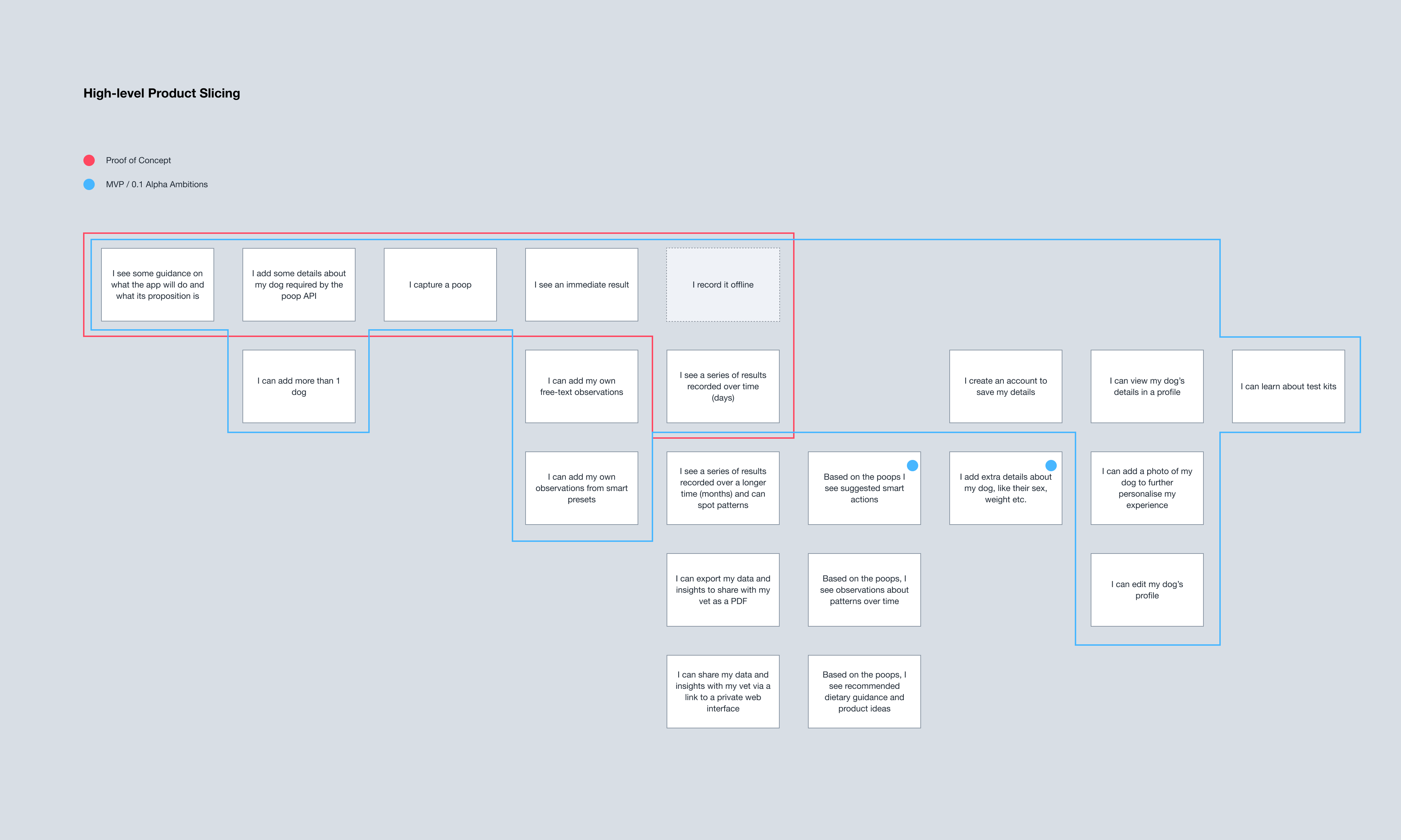
Throughout discovery and design we were thinking about which pet parent problems to address for a compelling first app release. We conducted product slicing exercises with the Mars team to carve out what defined the minimum valuable product: a slim but high quality experience to build upon.
Alpha Analytics and Optimisation
We integrated Mixpanel to provide the business and UX designers with clearer analytics around journeys and behaviours than standard analytics platforms, giving invaluable data to optimise against.
Release Process
Our method of working in this case was Agile Scrum. One of the many benefits of this practice is that we deliver tangible outputs every sprint (in our case, our sprint / time box is 2 weeks).
As we complete each sprint, our stack of done items grows. We will reach a point when we have the right amount or mix of "done" items that we and our Product Owner think make for a compelling release. The PO may also have directions from the business or other dependencies that drive what goes into a release and when.
We recommend getting into the habit of releasing small things often. Small releases are lower risk. They are less complex, more knowable, faster to test and to test well. As well as delivering new value to users, this also gives the opportunity to fix bugs on a regular basis, keeping the app nice and clean and technical debt low. For a project like this, reaching a cadence of about 3-4 weeks between releases would be the ideal.
This doesn’t mean that we would never release major new features, only that we would do so in a lower risk and more controlled manner.
Deciding what to design and build
Once you’ve got a product out in the wild, you receive feedback from more sources than ever before. The product team has ideas and a backlog (ordered list) of things to deliver, the PO has their vision, research and ideas, stakeholders and SME's across the business will have input and needs to be met be they practical, strategic or political, and now your analytics are firing and your user base is commenting.
With such an influx of potential things to do, how do you sift through it all and decide what to do next? After a quick examination of the possibilities with a simple benefit test (e.g. does this idea have a clear benefit to either the user or the business) we then will follow a method such as RICE to score them:
Reach could be about how many people in our existing user base we think this new idea will positively affect (e.g. 80%), OR about how many new prospects we'll convert to being users (e.g. 10% of 1200 prospects = 120). It's up to the entire team to define the most valuable stat.
Impact is, of course, what degree of positive impact the idea will have on their experience. This could be minimal, small, medium, large, XL.
Confidence is our way of weighing up our intuitive versus evidentiary basis for Reach and Impact. How confident can we be in the scores we gave for those? Is it a hunch, or do we have more to go on? This could be low, medium, high, very high.
Effort is about the time and cost needed to realise the idea - whether that's due to technical complexity or resources needed. Again, a simple small, medium, large grading is probably all we need.
Obviously, Product Owner prerogative still takes precedence. After RICE, we still recommend further reducing risk and improving confidence with testing ideas (where appropriate e.g. if it’s a big piece of work) with cheap and fast low-fi stimulus.
Conclusion
With each new project we undertake, the key takeaway is always that carefully listening to and empathising with the people the product is aimed at - potential customers - only serves to create a more engaging and appealing experience. Which in turn obviously benefits the product owner.
By working with pet parents, scientists and examining previously completed quantitative research, we were able to create an app that helped to provide valuable insights for them, to allay anxieties and create a trustworthy experience even early on in our design process. That trustworthiness gave participants the confidence to purchase what would be an entirely new type of service to them, and to listen to the advice the app was giving.
Looking to the future, Mars now has a solid foundation on which to further extend the features of their app, and the cyclical ability to gather a wealth of GDPR-compliant data from their customers to utilise in other areas of their business, to create improved products, to better serve those customers.
